OS Launcher 18 - Phone 16 Max
- 4.7
- Rating
- 5.00M
- Installs
- Free
- Price
 Analysis by App-foxy
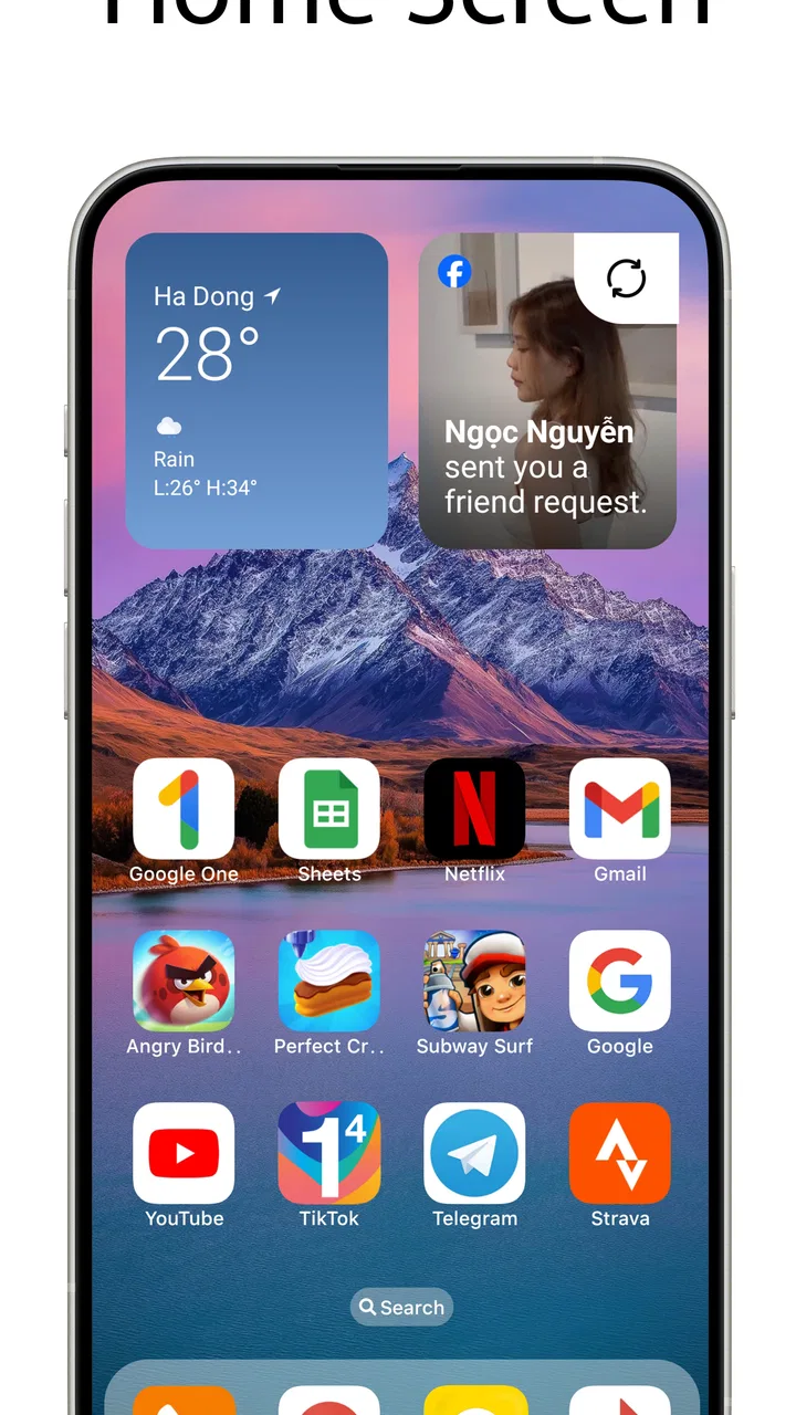
I installed OS Launcher 18 - Phone 16 Max to see whether its iDevice-inspired look is more than a quick coat of paint for Android. My first impression was clear: this is a personalization app built for people who want a simpler, more polished home-screen style without changing phones. It comes from NTStudio, is free to install, and is suitable for everyone. The current release is version 7.9, and it runs on Android 7.0 or later.
The appeal is easy to understand. Android gives you enormous freedom, but that freedom can also produce a busy home screen full of mismatched icons, widgets, folders, and shortcuts. This launcher aims in the opposite direction. Its visual idea is a clean, luxury-like interface modeled after the general appearance of an iDevice. If you enjoy that style, it can make an older or heavily customized phone feel more orderly in a short session.
What the launcher changes in everyday use
A launcher sits between you and many of the phone’s ordinary actions. It affects what you see when you unlock the device, how you reach apps, and how quickly you can return to familiar shortcuts. That makes this app more meaningful than a wallpaper pack, but it also means you should judge it by daily comfort rather than by screenshots alone.
You May Also Like

 Blood Strike: 2.5 Anniversary
Blood Strike’s Loadouts Turn Every Drop Into a Tactical Gamble
A close look at Blood Strike’s custom loadouts: how fast access to signature weapons reshapes its battle royale rhythm, rewards preparation, and narrows the gap between fights.

 Pandora - Music & Podcasts
Pandora’s Music Is Easy to Start, but Harder to Recover
Pandora’s strength is its low-effort path from a seed to a station. Its weak spot is how much confidence it asks you to place in connection, setup, and quiet recovery.

 8 Ball Pool
 Is Built on Rivalries, Rematches, and Routine
A close look at the rivalries, rematches, shared routines, and unanswered safety questions that turn a quick pool match into a persistent mobile community.

 Samsung Music
’s Quiet Strength Is Playing What You Already Own
Its reach comes less from spectacle than from dependable access to a personal library. That simplicity is both the app’s strongest retention engine and its ceiling.

 AccuWeather: Weather Radar
AccuWeather Review: A Quick, Clear Forecast for Everyday Decisions
For everyday plans, the best forecast is the one you can understand quickly. AccuWeather makes rain timing, radar, and local conditions easy to act on, with a few trade-offs.

 Hill Climb Racing
Why Hill Climb Racing Still Turns Crashes Into One More Run
A tiny car, a bumpy hill and one more upgrade: Hill Climb Racing keeps resurfacing because its simple chaos makes every near-miss feel personal.
More From Our News Desk



In my experience, the strongest reason to try it is visual consistency. Android phones often combine several design languages at once: the manufacturer’s icons, a third-party widget, a downloaded wallpaper, and folders arranged over several pages. An iDevice-style launcher gives those elements a common direction. The result is especially noticeable on a phone that has accumulated years of small customizations.
The store summary describes the goal as making a phone look simple and luxurious, while the short description calls it OS Launcher 18. I would treat those lines as a description of the visual direction, not as a promise that Android becomes an actual iPhone. Your phone remains Android, and its underlying settings, app behavior, notification system, and hardware do not change.
That distinction matters when deciding whether the app is worthwhile. If you want a different surface and a more controlled arrangement of apps, the concept makes sense. If you expect Apple-only services, iOS-exclusive functions, or an exact copy of every system screen, a launcher cannot deliver that kind of transformation.
A cleaner starting point for a cluttered phone
My practical advice is to begin with a small reset rather than immediately trying to reproduce every detail of the reference style. Remove duplicate shortcuts, keep the apps you use most within easy reach, and let the launcher’s simpler appearance do some of the work. A crowded layout can undermine the whole point of installing it.
One useful workflow is to separate everyday actions from occasional tools. Put messaging, calls, maps, music, and your regular browser where your thumb naturally reaches them. Move banking, travel, shopping, and editing apps into a second area or folder. This is not a special feature claim; it is simply the best way to make a visual launcher useful instead of decorative.
Another overlooked trade-off is that a familiar iDevice-like arrangement may feel elegant but not automatically efficient for every Android user. Android users often rely on widgets, app drawers, gesture habits, and manufacturer-specific shortcuts. If your current setup is highly functional, changing the appearance may also change your muscle memory. I recommend keeping the first arrangement deliberately close to your existing routine, then adjusting only what feels awkward.
How it compares with the usual personalization choices
The closest alternatives are a stock launcher, a manufacturer launcher, an icon pack, or a more configurable third-party launcher. A stock or manufacturer launcher is usually the safer choice if reliability, device integration, and familiar controls matter more than appearance. It may also preserve features that depend on the phone maker’s software.
An icon pack changes the look of app shortcuts but usually leaves the overall home-screen structure alone. That can be better if you like your current gestures and folders but dislike inconsistent icons. By contrast, an iDevice-inspired launcher is a broader change: it asks you to accept a new visual environment rather than making one small adjustment.
A highly configurable launcher is the better option for someone who wants detailed control over grids, gestures, transitions, widgets, and layout rules. The trade-off is time. You can spend an evening tuning a flexible launcher and still feel that it looks unfinished. This app is more attractive to me when the goal is a recognizable style with less tinkering.
There is also a privacy and comfort consideration whenever you replace a familiar launcher. I would take a few minutes to check which app is set as the default home application, how to return to the previous launcher, and whether the phone’s normal navigation still feels natural. Those checks are sensible with any launcher, especially before you commit your main device to a new interface.
Free access, optional spending, and the value question
The app is free to install, which makes the initial decision straightforward: you can test the look without paying an upfront purchase price. It also contains optional in-app purchases ranging from $0.99 to $9.49 per item. Because those purchases are not the same as the free installation, I would judge the basic experience first and only consider spending if the customization is already useful to you.
That pricing structure changes the value calculation. Someone who only wants to try an iDevice-like home screen may get enough value from the free access and stop there. Someone who wants every available customization may spend more, but the sensible question is whether those additions improve daily navigation or merely add more visual choices.
I would not install it assuming that paying automatically makes the phone faster, more secure, or more like a genuine iPhone. The value here is primarily aesthetic and organizational. If the free version gives you the appearance you wanted, there is no reason to treat optional purchases as necessary. If an important part of your preferred setup is locked behind a purchase, compare that cost with a one-time icon pack or another launcher before deciding.
The app’s audience size suggests that the concept has broad appeal. It has passed five million installs, with an average rating of 4.6 from around fifty-eight thousand ratings. Those figures make it easier to see why people try it, but they do not replace your own test. Launcher preferences are unusually personal: a layout that feels calm to one person can feel restrictive to another.
The developer is NTStudio, and the app was released on November 15, 2024. For a reader deciding whether to install it today, the practical information is that the listed version is 7.9 and the minimum Android requirement is 7.0. That leaves it accessible to many older devices, although compatibility on paper does not guarantee that every manufacturer handles a third-party launcher in exactly the same way.
Where the free experience earns its place
The free entry point is valuable for a very specific reason: it lowers the risk of experimenting. You can see whether the visual language suits your phone, whether your normal routines remain comfortable, and whether the new home screen feels more organized after several unlocks rather than just during the first five minutes.
Here is a realistic example. Imagine that you have an older Android phone used for work calls, messaging, calendar checks, and transit directions. Its default home screen has been modified repeatedly, leaving shortcuts scattered across pages. Installing this launcher, keeping only the essential work apps visible, and moving occasional tools out of the way could make the device feel refreshed without replacing the hardware.
It can also work well on a secondary phone used by a family member who prefers a visually simple layout. The everyone age rating makes it broadly approachable, but I would still configure the home screen around that person’s habits rather than assuming that an iDevice-inspired design is automatically easier for everyone.
The friction I would consider before switching
The biggest limitation is that a launcher changes the front door, not the whole house. Some Android screens will retain the phone maker’s design. Settings, notification controls, permission prompts, and individual apps may still look completely different. If visual mismatch bothers you, the result may feel polished in one place and inconsistent in another.
There is also a learning cost. Even a simple layout can make you pause when familiar shortcuts move. Users who rely on a manufacturer’s special home-screen tools or deeply customized widgets should be cautious. The more your current launcher supports a particular workflow, the more likely you are to notice what has changed.
Another trade-off is restraint versus control. A clean iDevice-style appearance works best when you accept its design direction. If you want unusual icon placement, elaborate information panels, or a very specific multi-page system, a customization-heavy launcher may serve you better. In that case, this app could feel too focused on its visual identity.
I would also avoid judging it solely by the first setup screen. The real test is repeated use: unlock the phone, open your most-used apps, search for something less common, check notifications, and return home. If those actions remain comfortable, the visual change has practical value. If you keep fighting the arrangement, a familiar launcher with a matching wallpaper may be the better solution.
Who is most likely to get good value
I recommend trying it if you want an Android phone with a calmer, more uniform appearance and you like the general design language associated with recent iDevice interfaces. It is particularly suitable for people who do not want to spend hours building a theme from separate wallpapers, icon packs, widgets, and layout settings.
It is also a reasonable option for refreshing an aging phone. A new visual arrangement cannot improve hardware performance, but it can reduce the feeling that the device is stale. That psychological benefit is real when the problem is clutter or boredom rather than speed.
I would be more hesitant to recommend it to power users who have carefully built a launcher-based workflow around custom gestures, dense widgets, or manufacturer-specific tools. Those users may find more value in preserving their current setup and changing only icons or wallpaper. I would also suggest skipping it if you dislike interfaces that imitate another platform; the central appeal will simply not be relevant to you.
People who need a launcher primarily for accessibility should test it personally before relying on it. A visually simple interface is not automatically easier to read, reach, or navigate. Text size, contrast, touch targets, and gesture comfort matter more than a luxury-style appearance, and those needs vary from phone to phone.
My buy-or-skip verdict
My verdict is to try the free version, but do not treat optional purchases as part of the basic recommendation. The app makes sense when your goal is a cleaner iDevice-inspired appearance and you are willing to accept that Android remains Android underneath. Its strongest value is the low-risk visual reset, not an all-purpose replacement for every Android feature.
I would keep it if the home screen feels calmer after a few days and my daily actions remain quick. I would remove it if notifications, widgets, gestures, or app access become less comfortable than before. That is the right standard for any launcher: the design should support your routine rather than become another project to maintain.
With a 4.6 average and more than five million installs, it is clearly a popular personalization choice, but popularity should not pressure you into paying for extras. Start free, organize the first screen around real habits, and test the less-used apps before making a final decision. For someone who wants a simple visual change, OS Launcher 18 - Phone 16 Max is worth trying. For someone seeking deep Android control, perfect system-wide imitation, or guaranteed improvement beyond appearance, I would choose a different kind of launcher.
FAQs for OS Launcher 18 - Phone 16 Max
01What features does OS Launcher 18 - Phone 16 Max offer?
OS Launcher 18 - Phone 16 Max provides a sleek interface that mimics the iOS experience on Android devices. It includes customizable home screens, intuitive gestures, a control center, and dynamic wallpapers. Users can enjoy a seamless blend of Android's flexibility with iOS aesthetics, offering a unique and personalized experience.
02Is OS Launcher 18 - Phone 16 Max compatible with all Android devices?
While OS Launcher 18 - Phone 16 Max is designed to work with most Android devices, compatibility can vary depending on the device's specifications and the Android version. It's recommended to check the app's requirements in the Google Play Store to ensure optimal performance on your specific device.
03How does OS Launcher 18 - Phone 16 Max affect battery life?
Using OS Launcher 18 - Phone 16 Max may slightly impact battery life due to its advanced features and animations. However, the app is optimized to minimize battery usage. Users can adjust settings such as animations and background processes to further conserve battery life if necessary.
04Can I customize the look and feel of OS Launcher 18 - Phone 16 Max?
Yes, OS Launcher 18 - Phone 16 Max offers extensive customization options. Users can modify icon shapes, grid sizes, and apply different themes. The app also allows for personalized gestures and shortcuts, providing a high level of customization to suit individual preferences and enhance usability.
05Is OS Launcher 18 - Phone 16 Max free to use?
OS Launcher 18 - Phone 16 Max is available for free with basic features. However, it may offer in-app purchases for additional customization options, themes, and premium features. Users can decide whether to enhance their experience with these optional purchases based on their preferences.
Pros
- Seamless iOS-like interface.
- Highly customizable features.
- Smooth performance on most devices.
- Frequent updates enhance stability.
- Minimal battery consumption.
Cons
- Ads can be intrusive.
- Some features are premium-only.
- Occasional lag on older phones.
- Limited widget customization.
- Requires access to many permissions.

OS Launcher 18 - Phone 16 Max
Gallery